Guiding Player Attention with a Scalable Notification Badging System

Context
Diablo Immortal is a mobile multiplayer game. Its red dot notification system was originally implemented without UX guidance—built reactively by feature owners to drive engagement. Over time, this created cluttered, overlapping alerts that confused players, obscured priorities, and disrupted onboarding.
I identified the opportunity to redesign the system to better support player attention, especially in a live game environment where new features and content drop frequently.
My Role
Owned the initiative end to end—from identifying the problem to driving adoption
Led discovery sprint
4 user interviews
12-person survey
Partnered with User Research + Data Analyst for deeper insights
Crafted and pitched solution
Presented system to internal leadership and NetEase co-dev partners
Integrated into pipelines
Partnered with QA + Production to build testing guidelines
Improved engagement and cross-team efficiency
Research
Players spent up to 60 minutes clearing red dots before engaging with gameplay
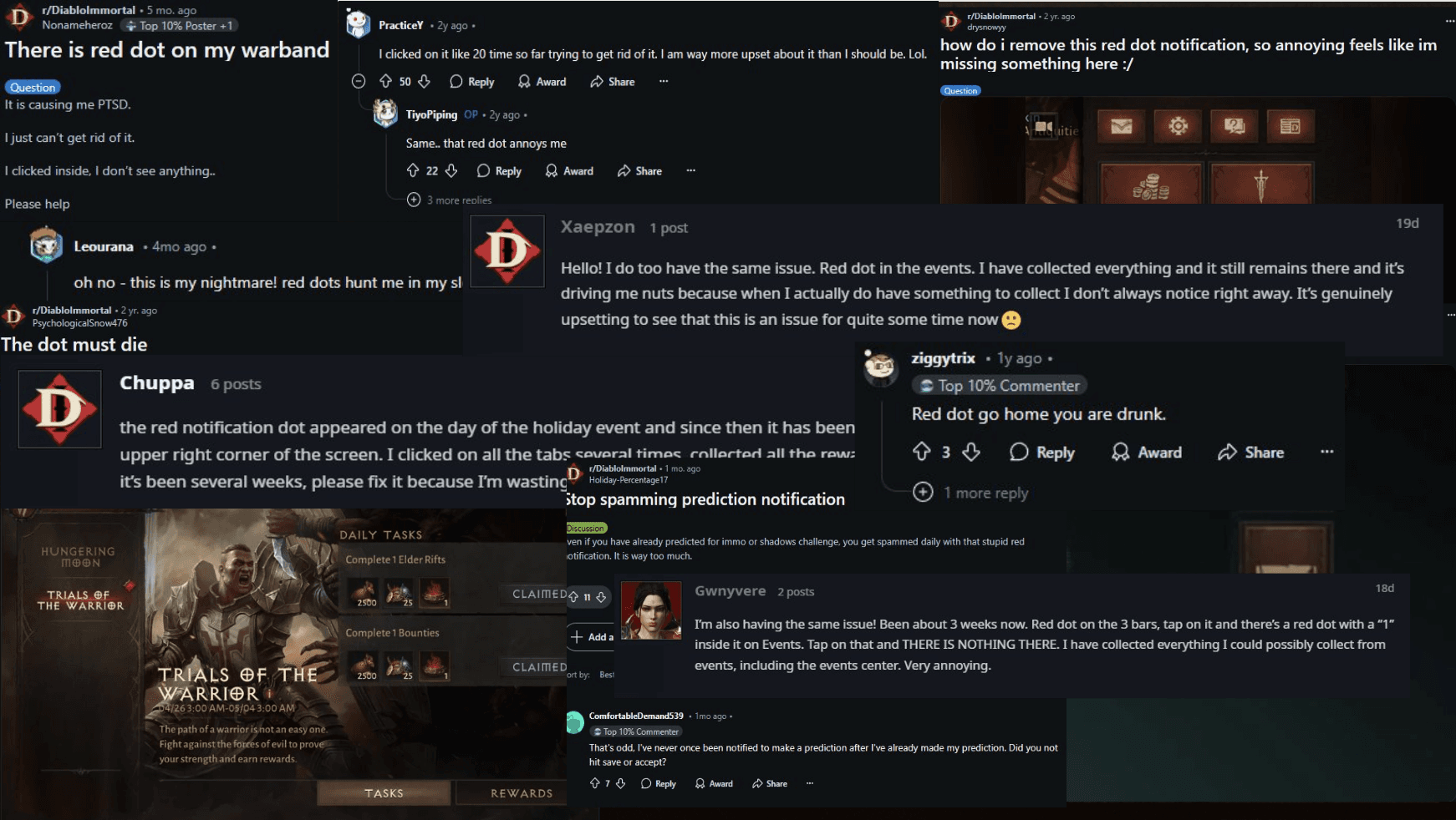
Notifications didn’t clear properly or surfaced irrelevant info
Red dot overload disrupted onboarding, especially during new feature rollouts
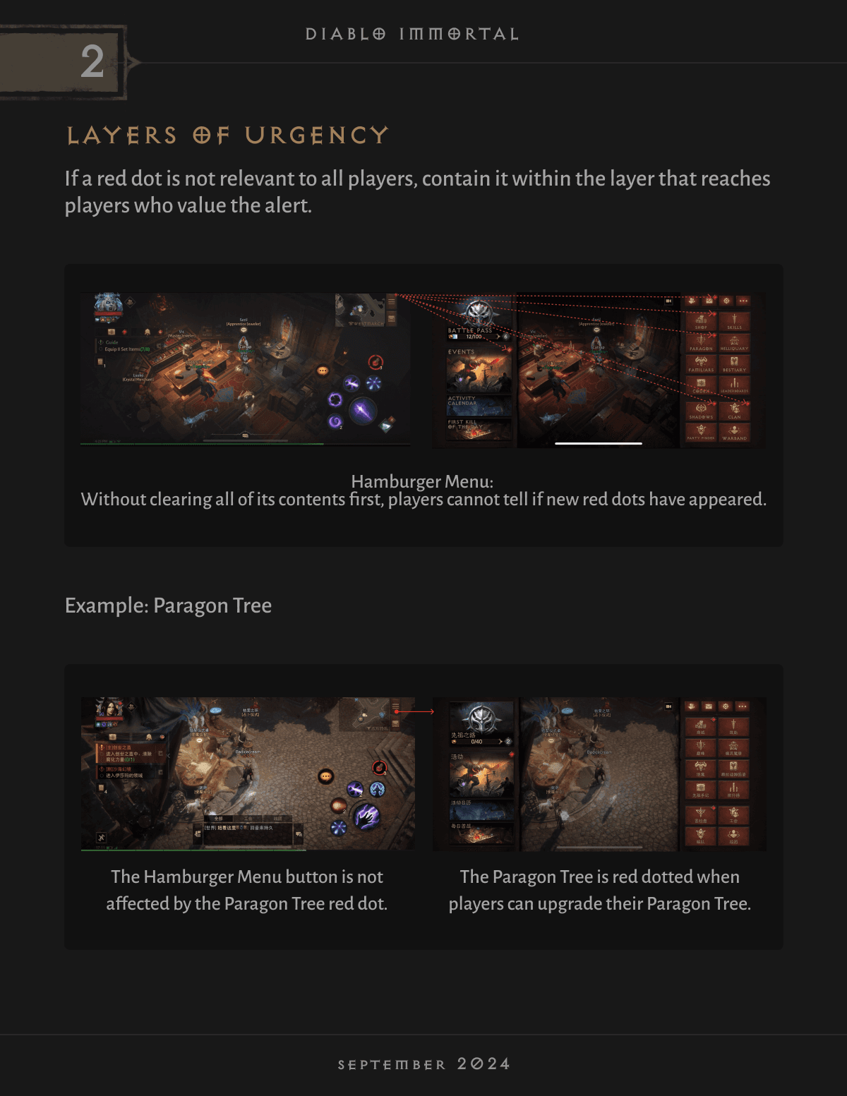
Inconsistent patterns caused confusion—players couldn’t tell what was important or actionable
Forum complaints echoed these themes, with players expressing frustration and notification fatigue
Strategy
My goal: reduce friction while still supporting discoverability for important, time-sensitive content.
To do this, I:
Mapped the full red dot system to reveal redundancies and logic breakdowns
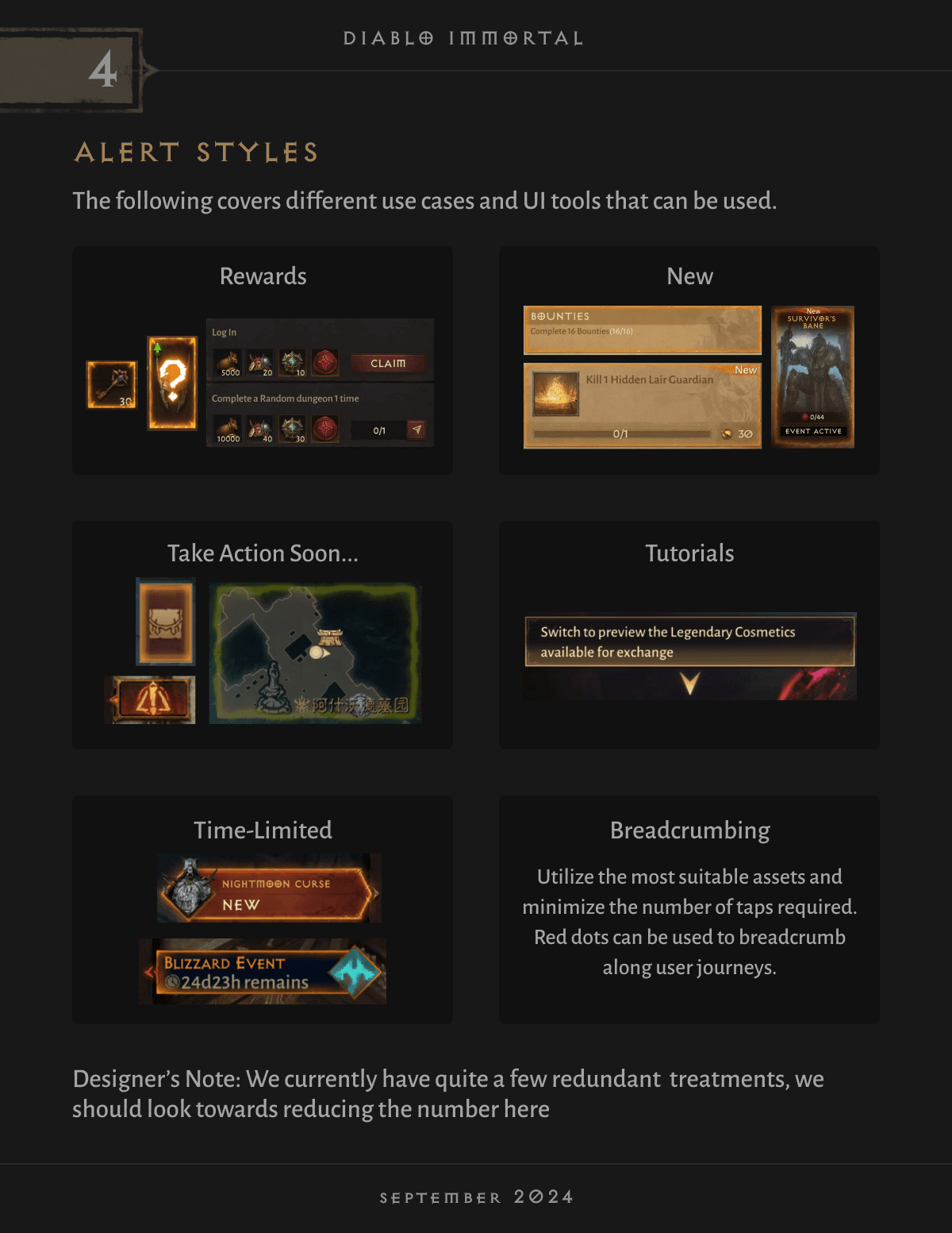
Grouped notifications by intent and player expectations (e.g., reward, action required, new content)
Defined a prioritized interaction model that respected urgency without overwhelming
Ran a card sort activity to organize our Notifications Hub around player mental models
Introduced behavior-driven prioritization logic based on engagement and feature state
Implementation
I created and socialized a unified set of UX guidelines and success criteria for red dot use, including:
Clear logic for when alerts appear and resolve
Interaction patterns tailored to feature context
Visual treatments for urgency tiers
To ensure adoption and long-term maintainability, I:
Created a JIRA epic for backlog cleanup and systemic fixes
Partnered with QA to flag logic bugs and inconsistencies going forward
Trained designers and engineers on scalable alert design
Shared findings with our NetEase co-dev partners for cross-team alignment

Documentation
This handbook now serves as the source of truth and rationale for notification patterns across the game in conjunction with its addition to our overall design system component library.